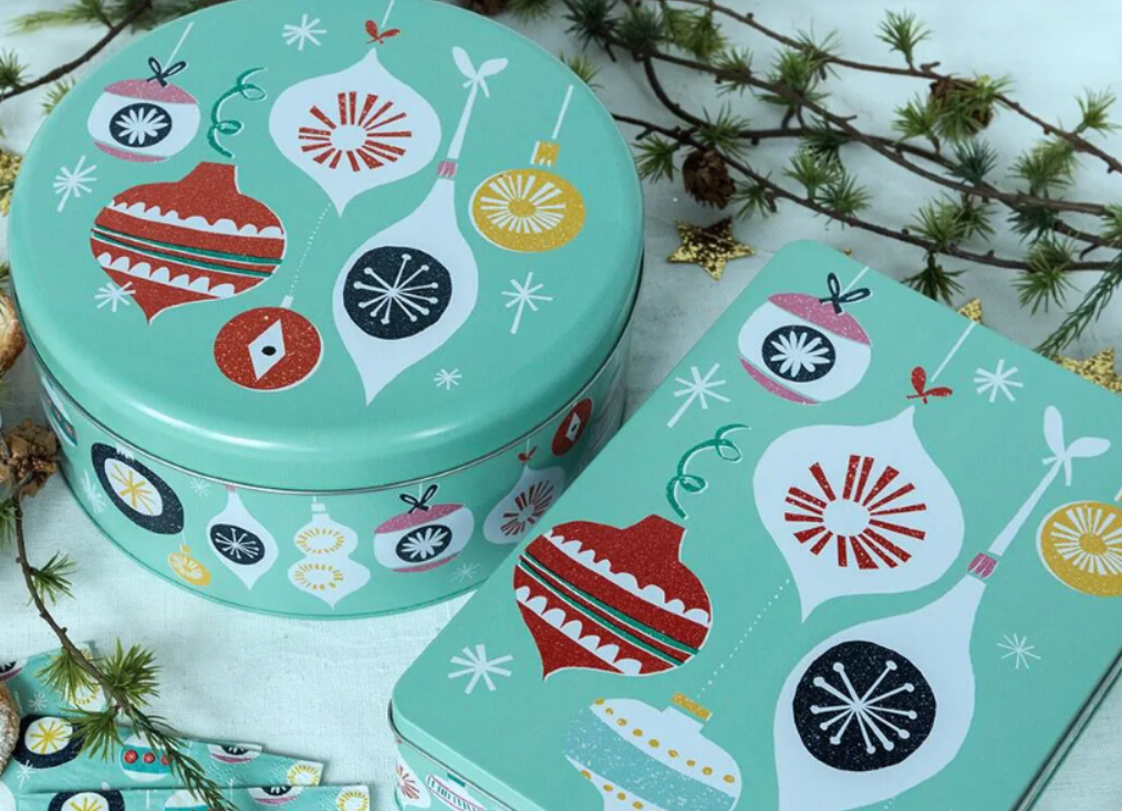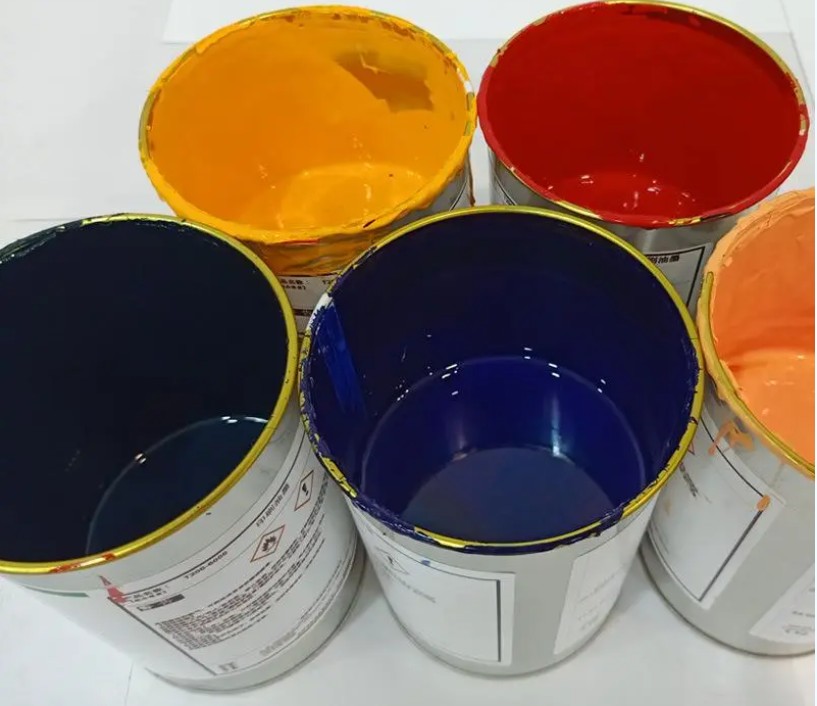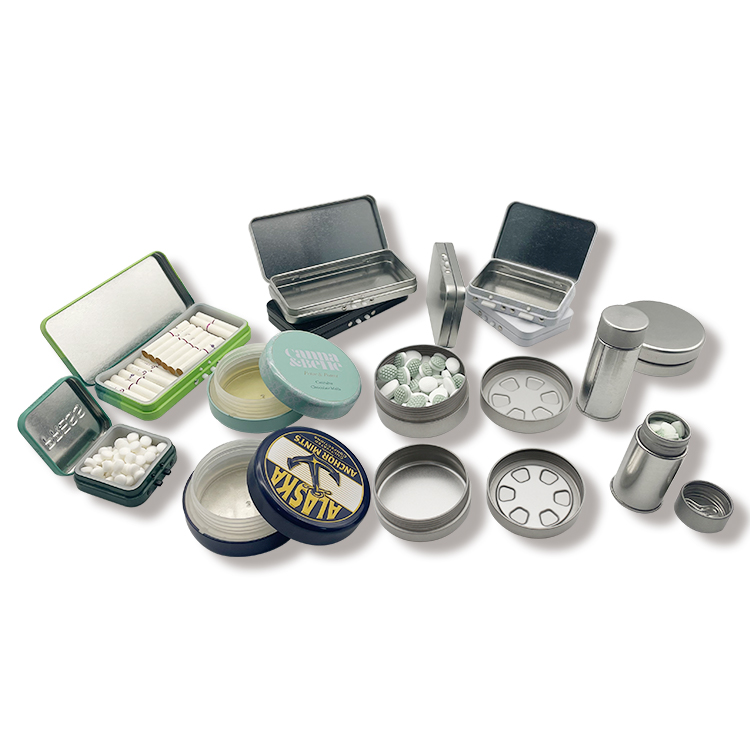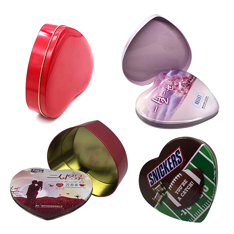
What do you know about the color matching on the iron box packaging design?


I believe that color is the first element that affects the senses. First of all, when people observe objects, the visual nerve responds to color the fastest, and produces perception and consciousness along with other sensory activities. Color quietly affects people's behavior, but also subtly affects people's emotions.
Therefore, the color collocation of tinplate can packaging design must be based on the scientific laws of color and a variety of survey reports, which can not only reflect the performance and use of the product itself, but also successfully attract eye-catching consumers. It creates the desire to buy in order to achieve the purpose of selling. By analyzing the color features and functions in the packaging design, this paper studies the principle of color matching in the packaging design and how to carry out color matching to make the product more eye-catching. So, can packaging design color need to pay attention to what points?
1. From an industry perspective, the normal colors of food are yellow and pink, which give people a warm and intimate feeling. Of course, green is used for tea and green and blue are used for drinks. Wine and cakes have a lot of red, and children's food has a lot of rose. The main color of daily cosmetics is mostly rose red, pink white, light green, light blue, and many dark coffee colors highlight the warm and elegant atmosphere, and clothing and shoes are mostly dark green, dark blue, brown or gray. The beauty of calmness and grace.
2. The light and heavy contrast of tin can packaging color (or dark and light contrast) is also one of the important reproduction technologies in the application of packaging color. This contrast is often a light background color. Set off a dignified and deep theme pattern, or in a dignified and deep theme pattern (mostly color block pattern). Lightweight and elegant packaging themes and names, as well as trademarks or slogans, are displayed on the contrary. Large areas of heavy and deep paint also serve as a base. In addition, light tones or focus on a certain color block or a combination of decorative patterns. In this light contrast, the general pigment has a coordinated color contrast and the contrast of cold and warm tones. The method of harmonizing color contrast is often light green to dark green; Light yellow to dark brown; Pink to red, etc., and the contrast between warm and cold colors is mostly black and white, red and blue.
3. Color matching principle: Through the use of color, the characteristics of the product are intuitively communicated to consumers, and the color matching design of the packaging should follow this principle. Color is the most flexible and diverse factor in packaging design. The principle of packaging design color and pure painting color is the same, but the packaging design color is a commodity color, rather than the pure painting color pursued by the painter. The colors in the packaging design should be able to protect, render and advertise the packaged goods. The combination of colors should enhance the visual impact of the packaging, attract consumers' attention, and have a strong appeal to consumers. Make consumers want to buy, play a silent promotion role.
What are the design elements of a product packaging with a high "appearance level"?
How do I know if it's a tin can? Just a few tips
Related Article